Diversity in graphic design: How to make your brand more inclusive
By Nina Scott
It’s often beneficial for brands and companies to advertise their products and services to a wide range of audiences. A great way to do this is through graphic design.
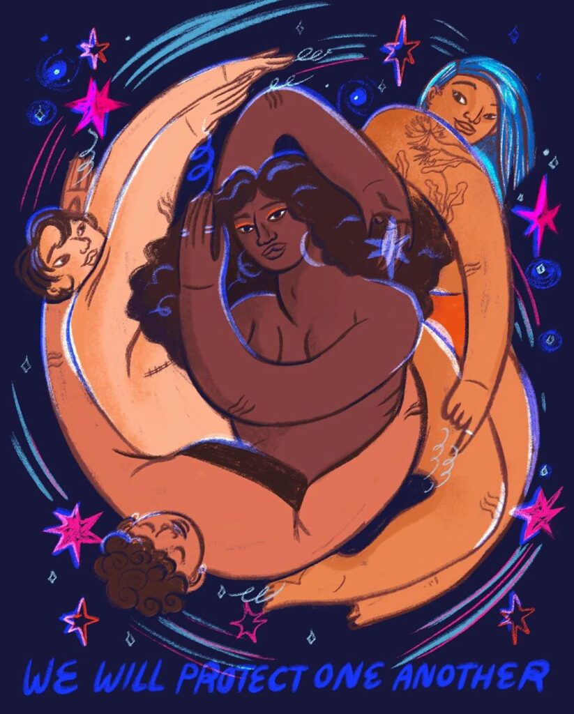
Particularly when designing advertisements that depict people, incorporating different skin tones, body shapes and abilities can be both appealing to the eye and persuasive to customers of all backgrounds.
Diversity in graphic design #1. Include different skin tones
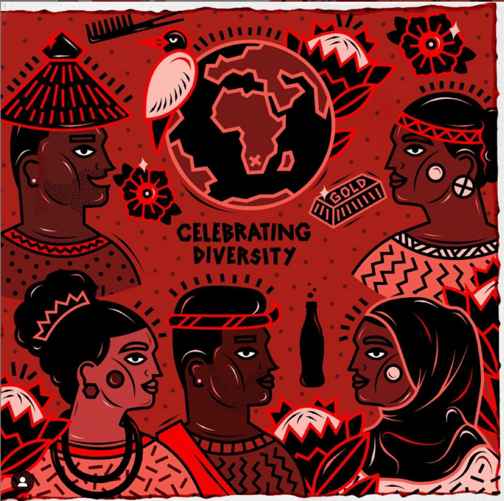
Embrace the entire spectrum of human skin by incorporating light skin tones, medium skin tones, dark skin tones and everything in between. Skin doesn’t have to be limited to the typical tans and browns; branch out to greens, purples and oranges to add a more stylized and diverse look. Incorporate browns and tans into page backgrounds or the text of your graphics to convey a more earthy, welcoming feel.
Use polygons to add facial diversity
Experiment with different shapes and sizes for eyes, nose, lip and hair designs. Eyes don’t always have to be almonds – they can be circles, squares and even triangles.
Play around with shapes and lines, and run your graphic by a diverse group to filter out any possible offensive images. There is a fine line between cartooning and offensive caricaturing, and it may take experience and experimentation to depict people of different ethnicities in an accepted manner.
Include different body types
Whether your brand’s style is flat and simple or detailed and illustrated, different body types can always add an edge to your designs. Humanoid graphics can be tall and lanky, short and wide, or medium and curvy.
In real life, human bodies come in all forms, so expand upon the typical stickman illustration to provide both inclusivity and originality.
Illustrating an audience with colostomy bags, wheelchairs, prosthetic limbs and other forms of physical disabilities demonstrates that your brand is accommodating to people regardless of their physical limitations.
Make your graphics accessible
Many internet users or viewers of advertisements may have disabilities that make it more difficult to read graphic designs.
Make sure text is legible and choose colors throughout the graphic that contrast each other greatly. Try not to use small font sizes that would cause viewers to squint, and be cognizant that some viewers may be color blind.
The graphic design choices you make determines the aesthetic and accessibility of your brand.
Make a lasting impression
Be an inclusive brand. Word of mouth will travel that your brand is open and accommodating to people of all cultures and backgrounds.
Showcasing your brand’s inclusivity through graphic design is the first step towards establishing your business as a locale of acceptance and positivity, aiding your outreach and keeping regular customers satisfied. It’s important to let all sorts of potential consumers know they’re welcomed. Here at the 1893 Brand Studio, we have a diverse group of graphic designers dedicated to ensuring quality and inclusive branding for your company.
Example posts

From https://bit.ly/2TbpBIj 
From https://bit.ly/35jvVTI 
From https://bit.ly/35icF93 
From https://bit.ly/3dJMw6Z 
From https://bit.ly/2HnRHgI

